6.9 AF correlations between populations
What if we compare AFs between populations? Do we expect the same variant to have the same AFs in, for example, Africa and Europe?
Plot African vs. European AF on a scatterplot.
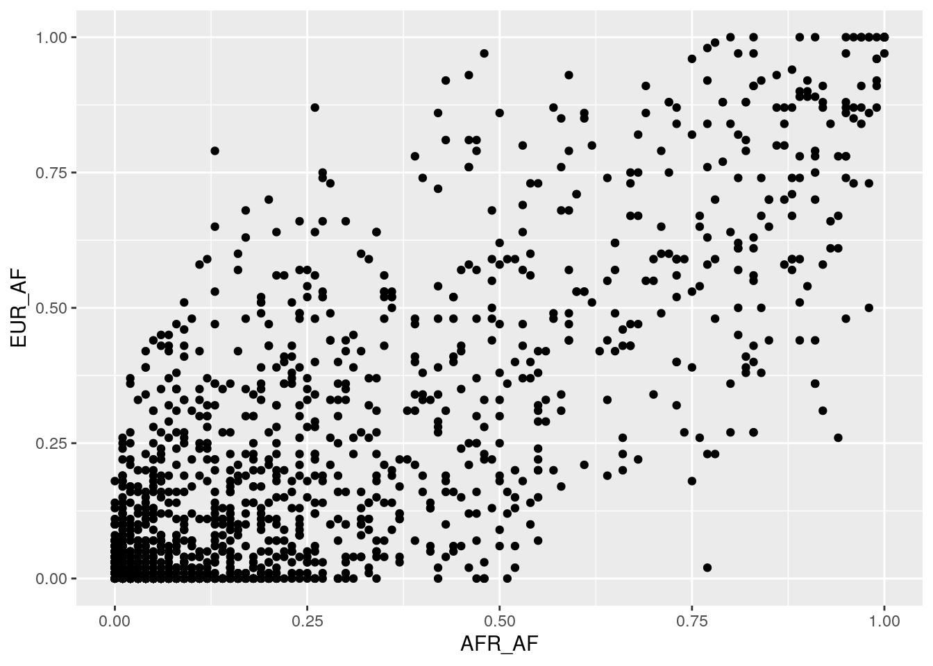
Most of the variants lie near the x = y line, showing that there’s a lot of correlated AFs between African and European populations. This is due to these populations’ recent common ancestry.
Outlier variants, with very different frequencies in different populations, may have reached these different AFs due to the effects of selection – which we’ll discuss in a later module.
Plot AF correlations for some other population pairs. Do you notice any differences in the distributions?
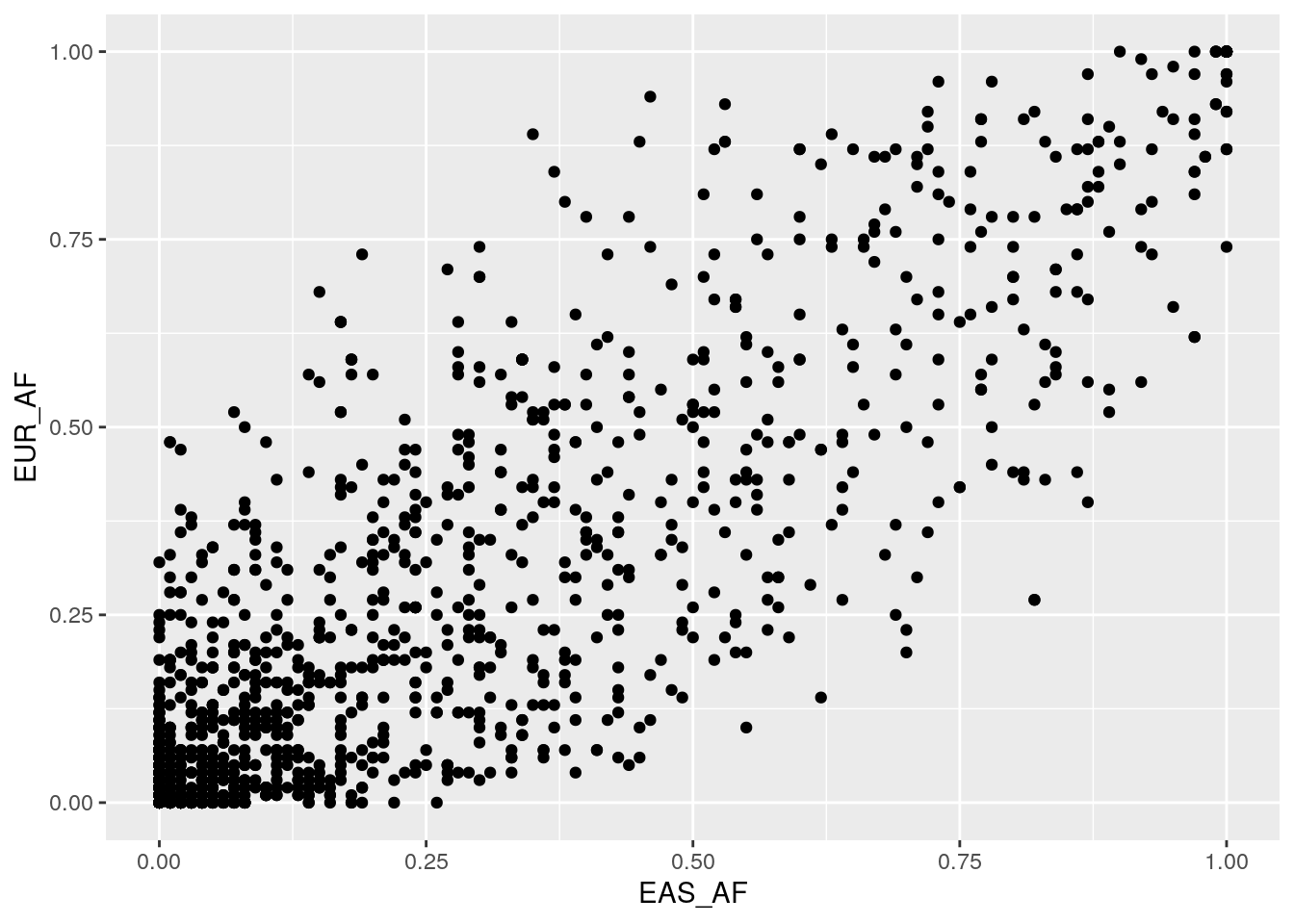
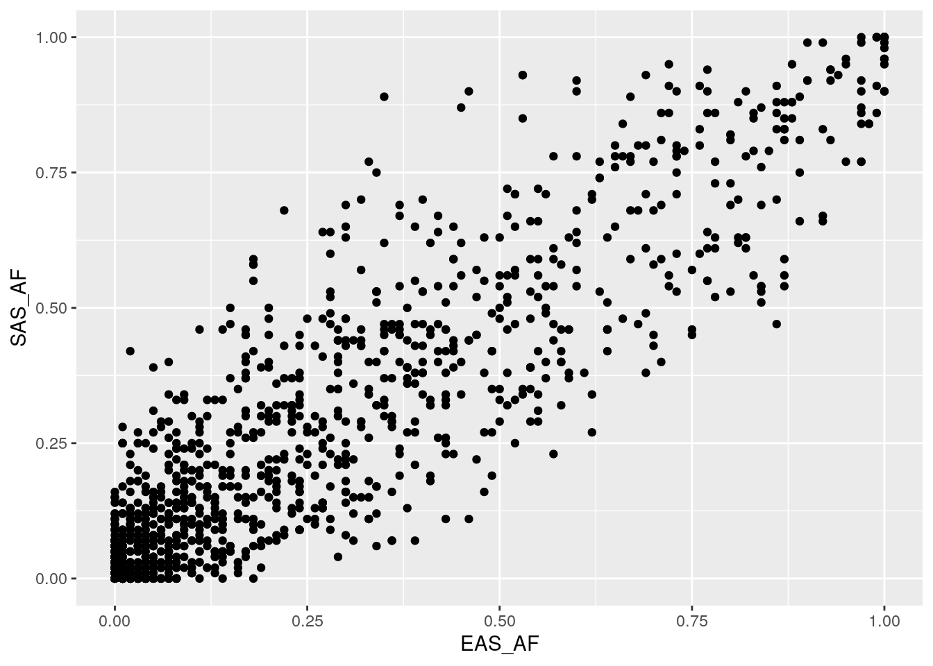
There’s less spread away from the y = x line for the EAS-SAS comparison. Because these populations share a common ancestor more recently than EAS-AFR, there has been less time for drift to change AFs between the populations.