7.6 QQ plots
One common visualization for GWAS results is a QQ plot, which compares the distribution of p-values in our results to a null distribution (i.e., the uniform distribution that we plotted earlier).
How do you make a QQ plot?
- Generate simulated p-values from a uniform distribution – the number of simulated p-values should equal the number of actual p-values
- Sort both your real and simulated p-values in descending order
- Plot the first, second, third, etc. p-values, where
- x-axis is the simulated value
- y-axis is the actual value
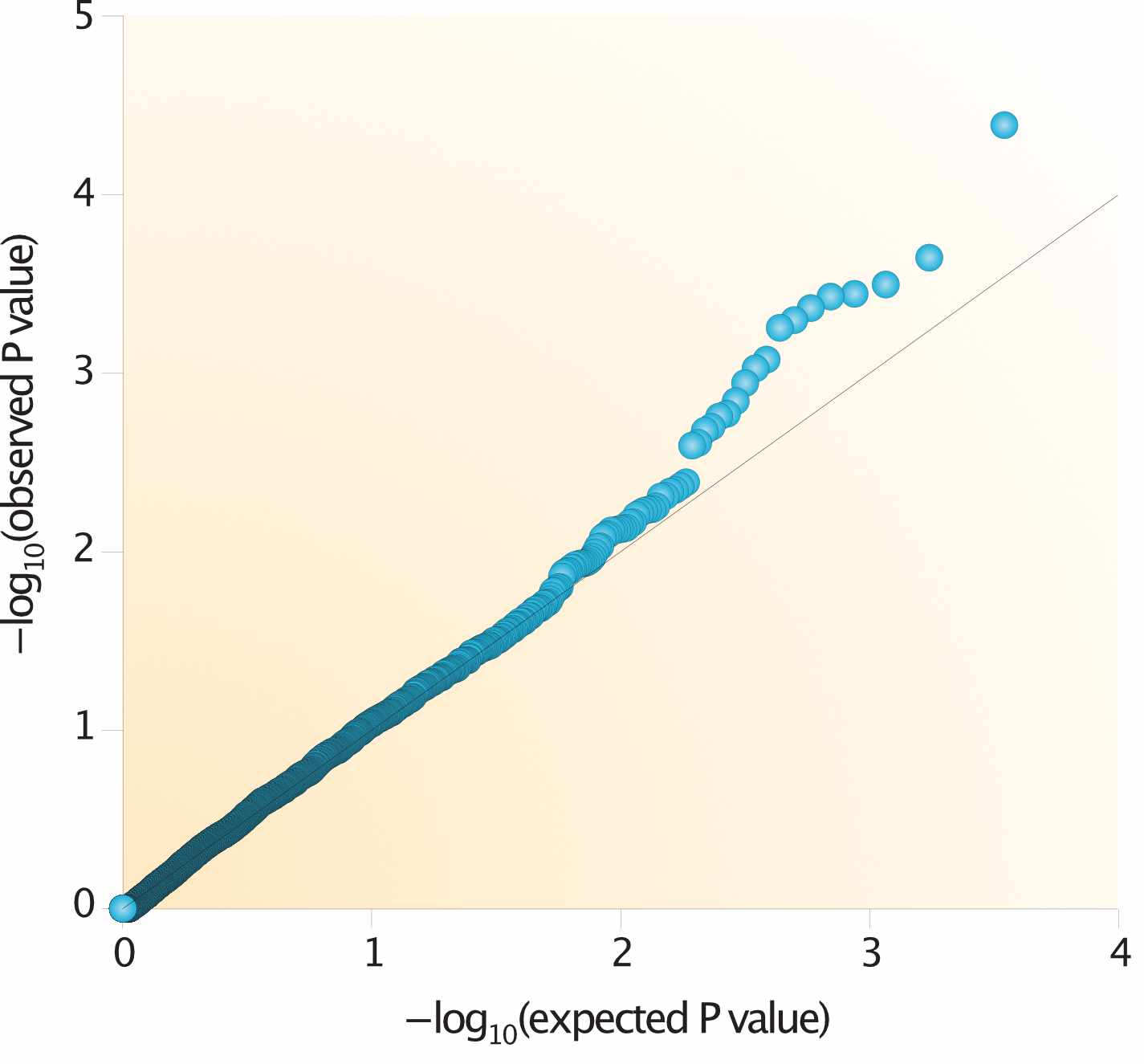
Fig. 5 (source). QQ plots visualize the distriution of p-values compared to a null distribution.
There are three areas of this plot where points can fall:
- On the \(\mathbf{x = y}\) line: No association signal
- Above the \(\mathbf{x = y}\) line: Some association signal
- Below the \(\mathbf{x = y}\) line: Issue with our statistical test (ex: not appropriately adjusting for covariates)