6.10 Common variation
For the rest of this lab, we’ll use the common dataframe, which includes only variants where \(0.05 < \textrm{AF} < 0.95\). We can look at where this set of common variants lies on the full AFS by adding vertical lines at the cutoff allele frequencies:
ggplot(data = all,
       aes(x = AF)) +
  geom_histogram(bins = 100) +
  geom_vline(xintercept = 0.05, linetype = "dashed", color = "blue") +
  geom_vline(xintercept = 0.95, linetype = "dashed", color = "brown")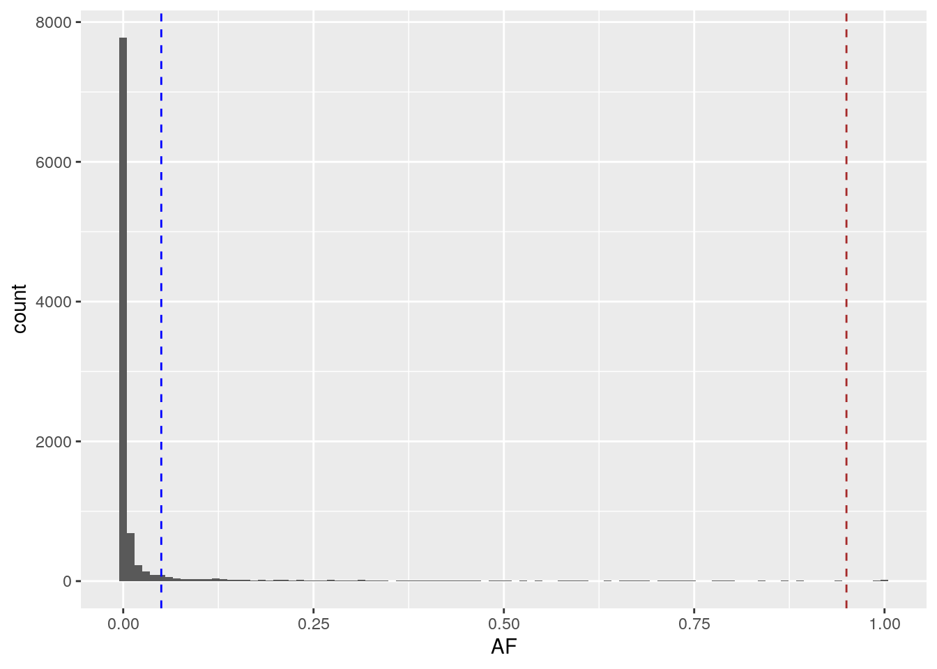
Plot the AFS of the common dataframe, including the dashed lines we used above.
ggplot(data = common,
       aes(x = AF)) +
  geom_histogram() +
  geom_vline(xintercept = 0.05, linetype = "dashed", color = "blue") +
  geom_vline(xintercept = 0.95, linetype = "dashed", color = "brown")
## `stat_bin()` using `bins = 30`. Pick better value with `binwidth`.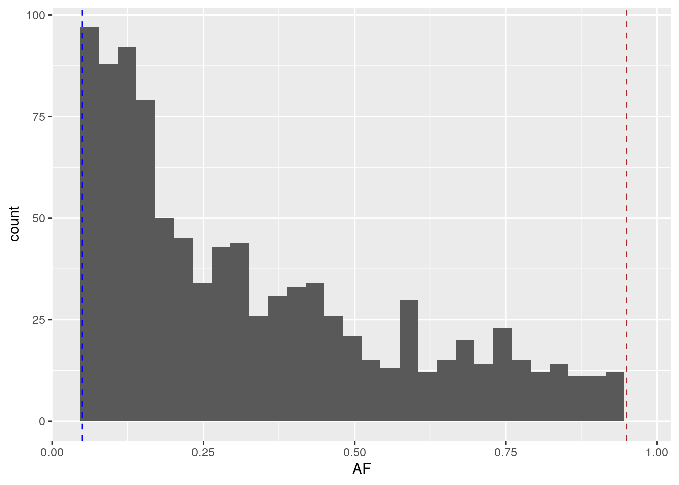
All of these variants lie within the dashed lines. Even with just common variation, we still observe an exponential decay of the allele frequencies.
Also note that there are only 960 variants in the common dataframe – substantially less than the 10,000 in the all dataframe.
Why only work with common variants?
Rare variants are more likely to show fine-grained population structure – for example, a variant may be carried by just one individual, or just one family. Because there are so many rare variants, including them causes differences between individuals to be more pronounced than differences between populations.
While this is a biologically true statement, it makes it harder to visualize population structure, which is why we subset to common variation for PCA.