9.17 Manhattan plot of PBS results
We can visualize our PBS results by generating a Manhattan plot where we plot PBS on the y-axis instead of p-values.
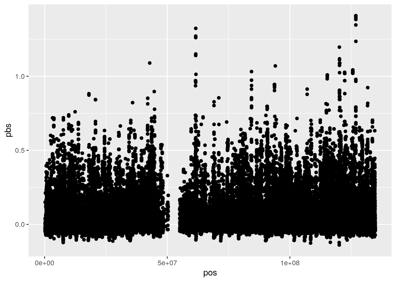
As evidence of positive selection, we are interested in both the height of the peaks in the plot, as well as the number of SNPs that comprise each peak (which is a proxy for haplotype length).