7.7 Manhattan plots
Manhattan plots show the distribution of GWAS hits across the genome, where the y-axis is p-value.
</br.
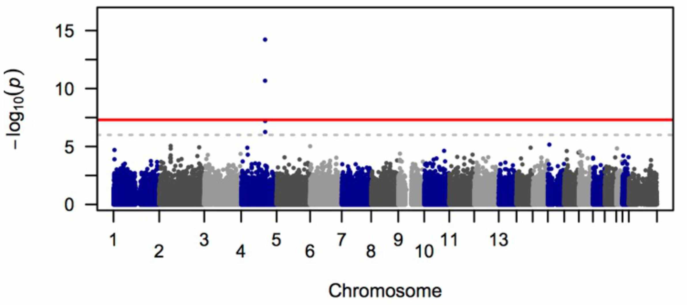
Fig. 6. Manhattan plot of GWAS results. The red line is the \(5*10^{-8}\) genome-wide significance threshold.
Why are there peaks in the Manhattan plot?
Each peak is composed of variants from the same haplotype, which all have a strong association with the phenotype because of LD.