6.16 PCA plot
Create a scatterplot of PC1 vs. PC2, coloring by the superpop column.
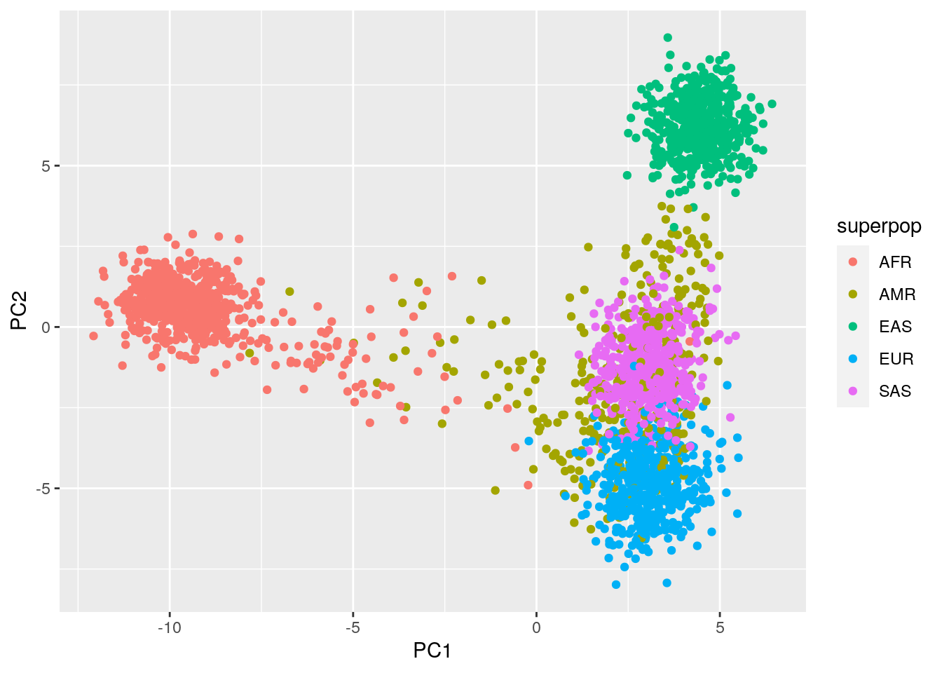
PC1 separates out the African populations from other populations. This is in line with our knowledge that all non-African populations descend from historical migrations out of Africa – African populations contain significant genetic diversity that is not represented outside of Africa.
PC2 seems to separate the East Asian and European populations from the other three superpopulations.
Repeat the plot with PC2 vs. PC3. Which superpopulations do you observe separating on PC3?
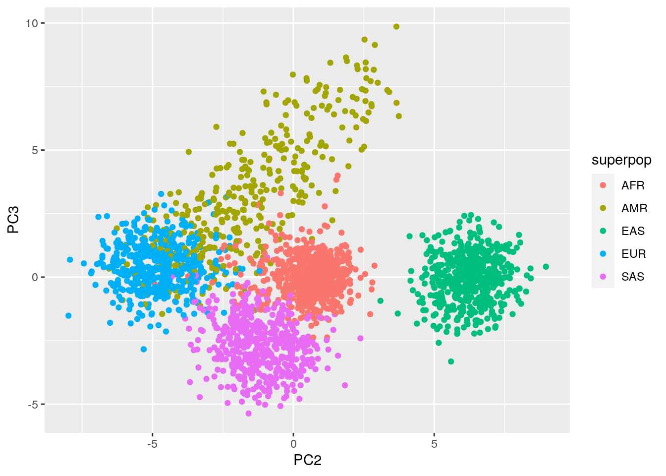
PC3 separates out the Admixed American and South Asian populations, which were collapsed into one group in the first PCA plot.