3.4 Visualizing the data
We can use our tidied data to ask questions about the de novo mutation rate in these Icelandic individuals. How does parental age affect the number of DNMs for males and females?
Use the dnm_by_age data to plot this relationship for males.
ggplot(data = dnm_by_age,
       # specify where ggplot should be getting the x location for each data point
       aes(x = Father_age,
           # specify where ggplot should be getting the y location for each data point
           y = n_paternal_dnm)) +
  # specify that the data should be plotted as points
  geom_point()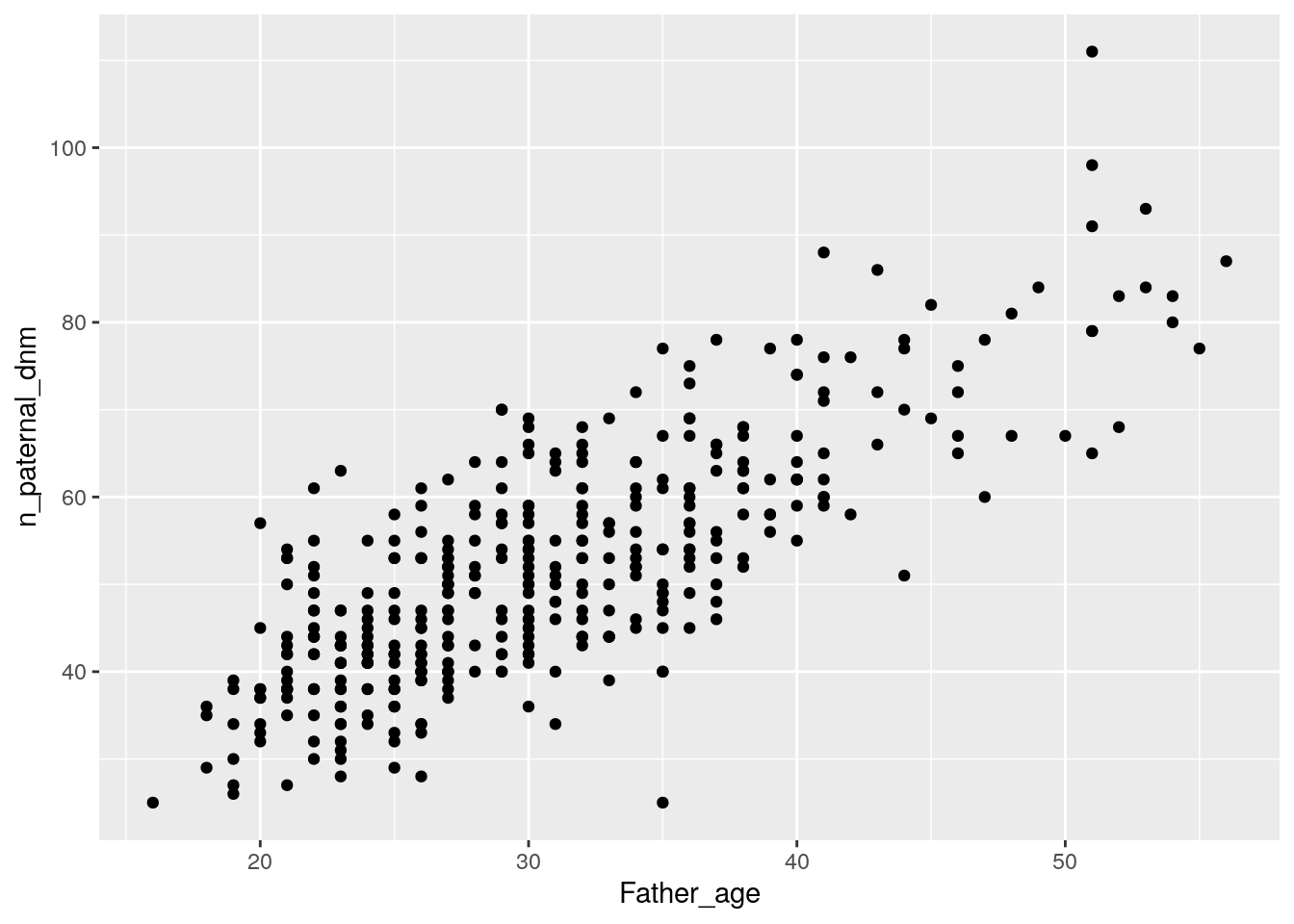
Based on your plot, would you say that there’s an association between paternal age and number of DNMs?
It looks like there’s a pretty strong association between paternal age and number of DNMs, where older males have more DNMs.
Modify your code to plot the relationship between age and number of DNMs for females. Does there seem to be an association between maternal age and number of DNMs?
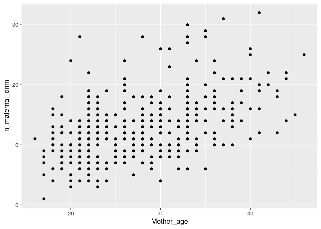
There’s also a strong positive association between maternal age and number of DNMs, although the slope (i.e., the increase in number of DNMs per year) is shallower.