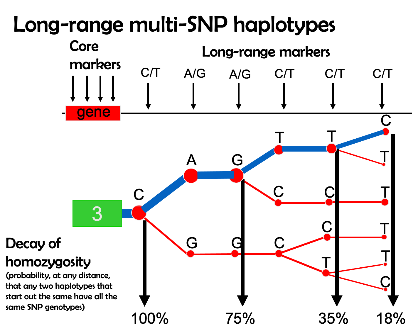
9.21 Plotting EHH
EHH can be visualized with phylogeny-like plots like the one below. The width of the blue bar (the haplotype of interest) represents the haplotype’s frequency in a population, and the steps in the plot indicate historical recombination.
The other branches of the phylogeny (in red) indicate other haplotypes in this region. An overrepresentation of one haplotype over the others creates the observation of extreme EHH.
EHH plot for real data
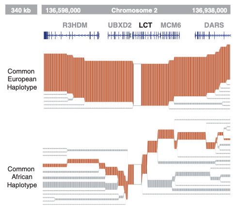
This plot shows EHH calculated for the CEU population of 1000 Genomes (Utah Residents [CEPH] with Northern and Western European Ancestry), zoomed in at the lactase (LCT) locus. A haplotype in this locus underwent a selective sweep in ancestor of European populations that allowed digestion of milk into adulthood, resulting in a present-day signature of EHH that stretches across megabases of sequence.
In contrast, the ancestral haplotype (bottom) displays a much greater diversity and recombination.