4.13 LD in association studies
The figure below is a locuszoom plot – a common visualization of data from genome-wide association studies (GWAS). This particular study was a GWAS for genetic variants that impact mean corpuscular hemoglobin concentration.
- The left y-axis is the p-value for the association with mean corpuscular hemoglobin concentration
- Each variant is colored by its \(\mathbf{r^2}\) with the top hit variant (in purple)
- The heatmap on the bottom shows pairwise LD between variants
- The right y-axis and dark blue line show the frequency of recombination events. Peaks are recombination hotspots (note how they line up with the boundaries of LD blocks in the heatmap)
We can observe a block of red/orange variants with almost the same p-value as the top hit. All of these variants are in strong LD with each other: all of them except the leftmost cluster fall within the same LD block in the heatmap on the bottom. As a result, any of them could be causal – i.e., the one that actually affects corpuscular hemoglobin.
This is a problem that affects all association studies. Two common ways of working around LD to identify causal variants are:
- Statistical fine mapping: Uses patterns of LD and statistical models to narrow down casual variant sets
- Experimental screening: Tests candidate variants in vitro (ex: massively parallel reporter assays, CRISPR screens) to determine which have functional effects
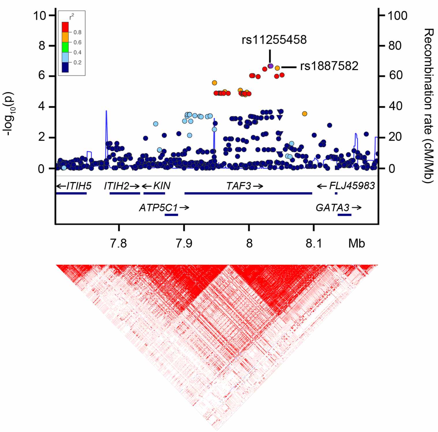
Fig. 7. GWAS associations with mean corpuscular hemoglobin concentration, from this paper.