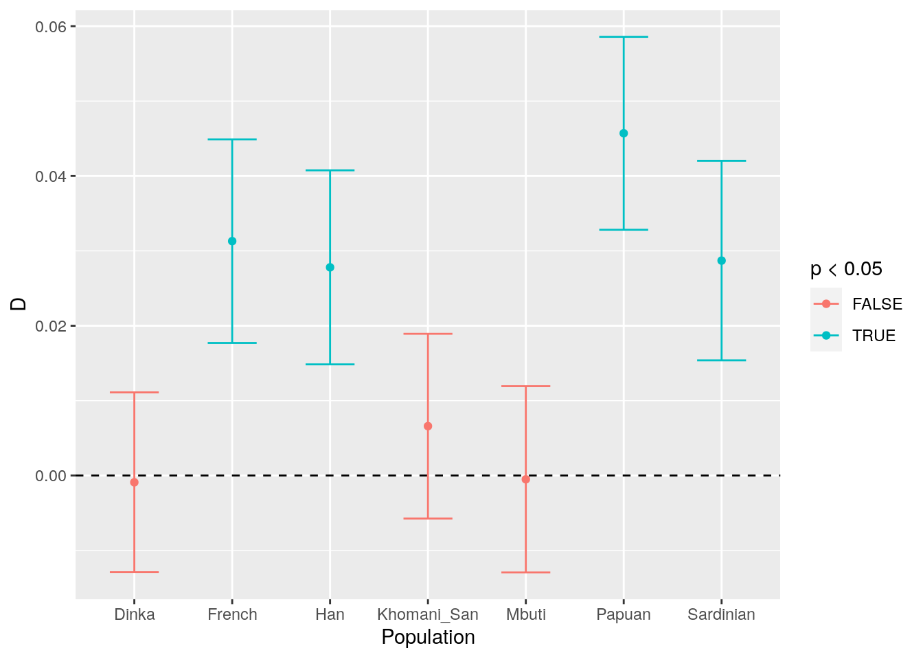
10.13 Plotting the D statistic
Use this code to plot the \(D\) statistic and standard error calculated for each population. This is a visual representation of the data in the d_result table:
ggplot(data = d_result,
       aes(x = W, y = D, color = p < 0.05)) +
  geom_point() +
  geom_hline(yintercept = 0, linetype = 2) +
  geom_errorbar(aes(ymin = D - 1.96 * stderr, ymax = D + 1.96 * stderr),
                width = 0.5) +
  xlab("Population")