6.8 Theoretical AFS
Population geneticists have estimated that under neutral demographic expectations, each bin of the AFS should have a height that is equal to 1 over its bin number.
We can use this to plot the expected AFS:
# make dataframe with theoretical AFS bins
# create `af_bin` column with the bin number
ideal_pop <- tibble(af_bin = 1:100) %>%
  # create `prop` column with the expected proportion of variants
  mutate(., prop = 1 / af_bin)

head(ideal_pop)
## # A tibble: 6 × 2
## af_bin prop
## <int> <dbl>
## 1 1 1
## 2 2 0.5
## 3 3 0.333
## 4 4 0.25
## 5 5 0.2
## 6 6 0.167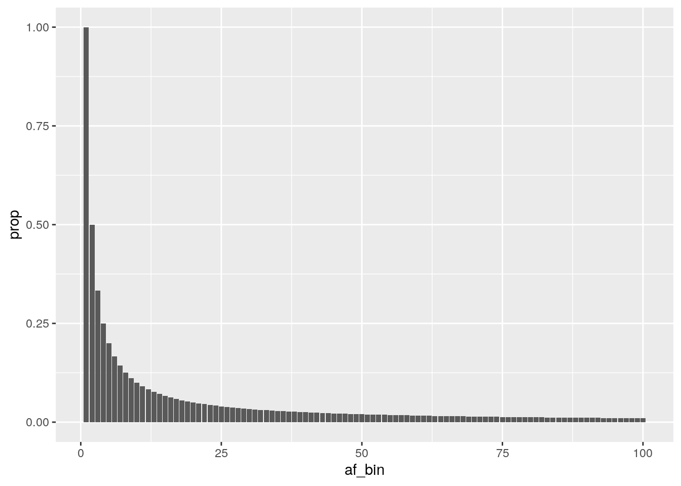
How does this compare to the AFS we see from human data?
The human AFS has many more rare variants, which manifests as a higher peak on the left side of the AFS. This is due to recent population expansion in humans, which results in more human individuals and an accumulation of excess new rare variation.
How would you expect the AFS to look for a contracting population (ex: endangered species)?
A contracting population would result in the extinction of many alleles, resulting in more variants that drift to high frequency or go extinct. The AFS for this type of population would look more flat than the neutral expectation (fewer rare alleles, more common ones).