6.17 Proportion of variance explained
It’s hard to tell from the PCA plot whether the separation of populations we see is meaningful, or if the plot is just exaggerating extremely minor differences between groups.
We quantify this by calculating the proportion of variance explained for each PC. This tells us how much of the variation in our data is being captured by PC1, PC2, etc.
Variance is the square of the standard deviation, so we can calculate proportion of variance explained from the sdev item in our pca object. Each value corresponds to the standard deviation for one PC.
## [1] 5.692102 3.818282 2.122236 1.954976 1.476041 1.450018The proportion of variance explained by a PC is its variance, divided by the sum of the variances across all PCs. Conveniently, you can calculate this for every PC at once in R:
# divide variance of each PC by sum of all variances
var_explained <- sd^2 / sum(sd^2)

# proportion of variance explained for:
var_explained[1] # PC1
## [1] 0.09645901## [1] 0.04340437## [1] 0.01340864So, PC1 explains only 9.65% of the variance in our data, PC2 explains 4.34%, and PC3 explains 1.34%.
Add x and y axis labels to your plots with the proportion of variance explained by each PC. This is common practice for PCA.
ggplot(data = pca_results,
       aes(x = PC1, y = PC2, color = superpop)) +
  geom_point() +
  xlab("PC1 (9.65%)") +
  ylab("PC2 (4.34%)")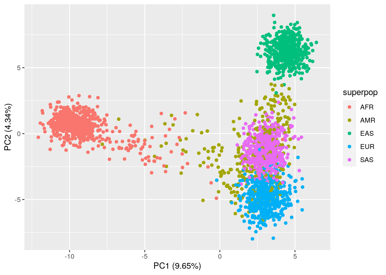
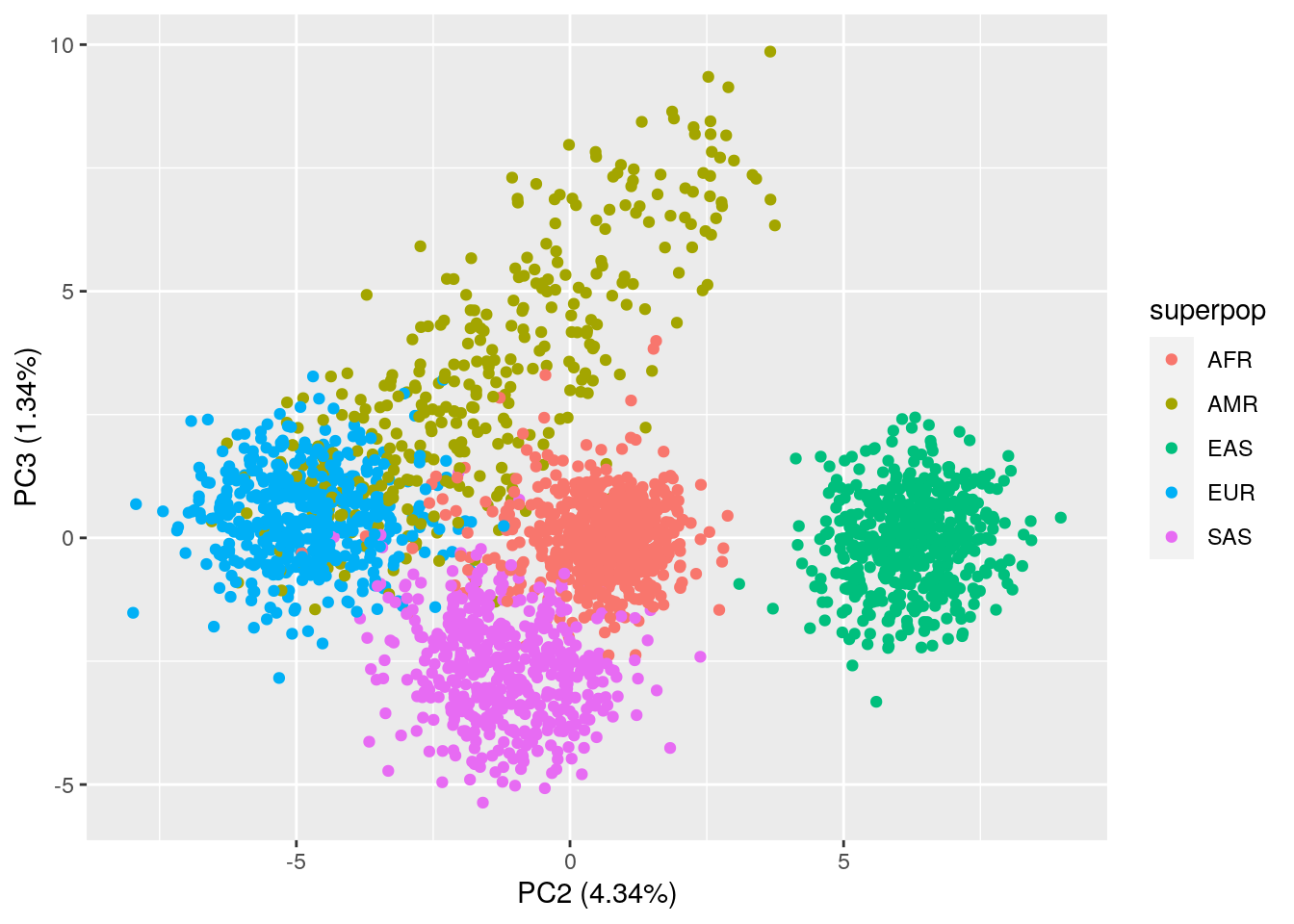
ggplot(data = pca_results,
       aes(x = PC2, y = PC3, color = superpop)) +
  geom_point() +
  xlab("PC2 (4.34%)") +
  ylab("PC3 (1.34%)")